The government has announced that it intends to save some money by merging and closing various state agencies. So far the common thread linking all the named agencies for the chop is that in some way they have opposed or embarrassed the executive during their existence.
However, I’d like to use this as an opportunity to address a favourite unreported topic. I’d like to discuss the explosion of new logos and rebrands of state agencies in the late 1990s-early 2000s. Many of these logos may be soon consigned to the history books so we ought to have a little chat about their collective significance while they still have one.
I can now exclusively reveal for the first time the key to successfully pitching for the lucrative job of designing the logo for a state body.
1. Choose your palette.
There is no choice.
You must never, never, try to use either the dark green historically associated with the Civil Service since the foundation of the state or the official blue of the State, as used on the cover of the Constitution.
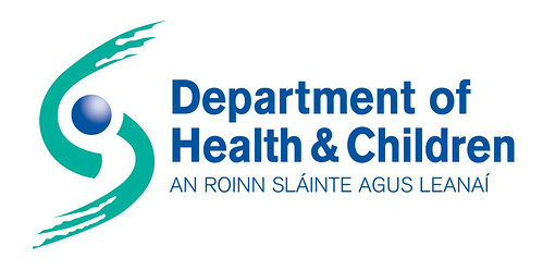
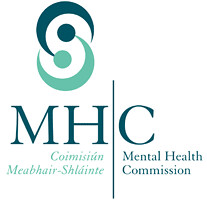
You can have aquamarine, sea blue, turquoise or lizard green. That’s it.

2. Choose your design.
Again, this isn’t really up for grabs at all. Your design will have two elements. Dots and swirls. Ideally, you ought to have one dot and two swirls.
Per:
and

and

and

and
 .
.
3. Justify your unoriginal design with Lots of Crapology.
This may seem difficult. But just follow the template of the Department of Health and Children’s style guide and you’ll quickly be raking up the fees. Be sure to charge an additional fee for providing your logo in black and white, in white on black, in JPEG TIFF and EPS and PDF formats. Even though you just have to ask Illustrator to save them like that without any extra effort.
4. Mutant Strains
These logos don’t follow the exact rules. Some have an extra dot, or have failed to follow the recommended colour palette. But somebody got paid for them all, so who are we to argue? Perhaps the dots and swirls are entering a period of evolution.
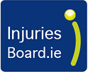
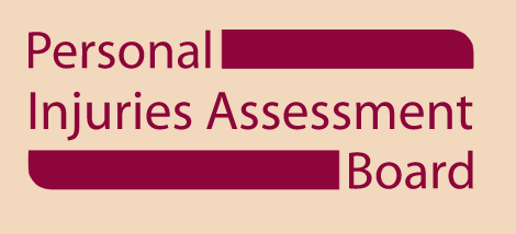
Which was a change from its previous PIAB Logo
This is me again.
If you think logos are meaningless doodles then we are about to part company. A primary part of my argument here today is to propose that a logo tell us a great deal about the organisation which adopts them. The twist is that usually what it tells us is not what the organisation wanted to say.
One of the first things a rebrand tells us about any organisation is that it has suddenly come into more money than it knows what to do with. Rebrands are expensive and mostly there are better things to spend your budget on if you’re supposed to be delivering a service to the public. But if you get a sudden, one-off burst of money the chances are your usual systems won’t be able to cope with the problem of allocating it constructively. You’ll find you are under-spending your budget allocation. This spells death in a public service context where your ability to argue for more money next year will depend on whether you can show you had to spend all your money this year.
The Department of Finance, for years on end, underestimated how much money would be taken in tax. At the end of those years, state agencies had a chance to up their budget for the following year if they could think of something non-recurring to spend it on. Combine that with the excuse that the government regularly renamed and sub-divided departments and the great State rebranding boom was born.
Logos don’t just arrive from a designer on a CD. That would be unimpressive and therefore difficult to charge significantly for. Instead there is a long- very long in some cases- series of meetings with ‘stakeholders’. The stated aim is to get to know the agency- its work and its values so that the logo designed is specially tailored to reflect it. See above for the actual value of these meetings.
Eventually around three versions of a new logo will be presented to the client agency. This gives the managers involved a sense of power over the process. One of these logos will be plainly shit, thrown in to make up the numbers. The other two will be variations on the same theme. I think we know what that theme is likely to be.
Repeatedly paying for unoriginal work reveals something else about our state agencies that they’d probably prefer not to have advertised. Despite being well intentioned and staffed, to a greater degree than is usually acknowledged, by intelligent, hard working people they are frequently susceptible to a snow job by exotic outside ‘experts’. This applies just as much to massive technology projects (electronic voting, ID cards) as it does to logo design.
Along with axing state agencies, the government announced that it intends to dramatically cut back on spending on consultants. It is a pity that it hasn’t pledged to examine how the Civil Service can develop the skills it needs to make sure that the money it does spend on those consultants isn’t wasted.
13 Comments
Isn’t the dot and 2 swirls combo actually shorthand for “Masonic globalists”? If not, can we pretend that it is? It’s the central thesis of my new Dan Brown-esque thriller about state agencies and the illuminati.
Dude, this is so going to get lifted by an enterprising journo. I suggest you pre-empt this by flogging it to the Sunday Business Post.
[…] Simon shows how you can win a logo tender got the Government. […]
[…] Simon on State logos. […]
Did you see how quickly the Transport 21 logo got a “make-over”? But then, the first logo did look funny over the door of a Dublin Bus, pointing its ‘dynamic’ arrow backwards.
The new Dept of Environment logo has been described to me as “slug porn” as (if you turn your head a little to the left) it does look like a gastropodal menage a trois.
Forgot to add – great post! This is the kind of thing I wish d’Irish blogosphere tackled more often. Keep it up (phnarr).
I’d like to thank the Green Pages in the middle of the Phone Book for my inspiration. Page after page of dots and swirls. It’s like its written in Morse Code.
[…] dear, it looks like tuppenceworth has nailed SFI’s logo. We’re obviously of the “one dot and two swirls” […]
But when you were reading the Green Pages did you see the picture of the dolphin hidden in the dots and swirls?.. It’s like one of those ‘magic eye’ pictures…
Swirls and dots, eh?
Like a damn fool I’ve been wasting time with 3D orbs and swooshes. Sigh.
Great Post!
You obviously have an insider knowledge of the public service, sensei! I thought only escapees knew about the great budget scramble, and it was a secret. You are so right about this – it’s like the ads for Transport 21 all over the place. Billboards, TV ads, radio ads… build the roads and shuddup about it, for God’s sake!
sorry for empty comment above.
click my name for a logo which uses a dot and two swirls